UP IN THEM GUTS: CHARLOTTETOWNE HOPS FC
UP IN THEM GUTS (named after one of my favorite albums from Planes Mistaken for Stars) is a series of blog posts where I do a deep dive into select projects. I cover the process from start to finish, so some may be longer than others. For more UP IN THEM GUTS posts, click here.
When I was approached to help brand a team in Charlotte, NC, with the main theme being beer, I was stoked. Though I no longer drink alcohol, I love the sense of culture and community that many craft breweries have. That’s never more apparent to me here in Fort Worth.
Disclaimer: It’s been a few months since I worked this branding up, and my memory sucks. So if I get some of the early details wrong, it is not intentional.
The name Charlottetowne Hops was decided pretty early on. I did ask if they planned on doing youth teams or sponsoring youth events. However, they wanted to go all in on the beer theme, and it makes sense. Charlotte has a thriving craft beer scene, and soccer and beer have been best friends since its inception (probably).
Most importantly, they wanted something that differentiated them from the MLS club, and I feel they got it right. I liked it right away. It had that old-English feel, and it was one of the area’s first names before settling on Charlotte (named after Charlotte of Mecklenburg-Strelitz, a German princess who became a queen consort to England and Ireland - source: Wikipedia… I know, don’t @ me, I sourced from other areas, too).
brandon walker, CC0, via Wikimedia Commons
To start, I did research on Charlotte itself (no, I didn’t just use Wikipedia). It’s a gorgeous area with rich history, so it was ripe for the picking as far as inspiration to pull from. One of the nicknames of Charlotte is The Queen City, so I immediately thought of using a crown somewhere in the design. I put that in my pocket and continued.
Though soccer is my top sport, I love most competitions. Baseball is way up there as well (GO BRAVES… and Rangers unless they’re playing the Braves), and one of my favorite styles is the simple 2-letter logo intertwined with each other (see NY Yankees and Mets, San Diego Padres, San Fran, etc etc). It’s classic, effective and instantly recognizable.
ROUND 1
Round 1
My initial offerings were very simple. There’s always the opportunity to throw more details in, but I wanted to get a feel for the style the owners were after. I also came up with the abbreviation “C-TOWNE” to use as a reduced-sized option for clothing, hashtags and whatnot. I would have used the three-letter abbreviation used by some other teams, but it definitely looks like a dirty word.
With the far left, I was going for something I could see on a beer label. I also did a more “queenly” (pretty sure that’s not a word) crown in the second from the left meant to swap out with the previous version. The “YE OLDE C-TOWNE” text was made to reveal the name, and the far-right version was a word mark test.
THE REVIEW
The owners felt that the crown is something that is used ad nauseam in the Charlotte area, so they wished to go in a different direction. They also wanted to get a more straight-forward beer reference in there. Regarding C-TOWNE, they loved it and wanted to keep it.
Eleni, one of the consultants on this project, came up with the idea to do the entire shape as a bottle cap instead of a normal circle. I thought it was brilliant, so I ran with it. Speaking of: before we get to Round 2 completely, let’s take a look at how I built the bottle cap.
BUILD-A-CAP
I’ve mentioned this before, but if you use Illustrator a lot, especially professionally (and this just means if you’re being paid for work, not exclusively someone working for an agency… gatekeepers), Astute Graphics Illustrator Plugins will save you so much time. This is an example of that.
A: Using the Dynamic Shapes plugin, I made a shape I thought looked like the outer teeth of a bottle cap. B: Ultimately, I thought the teeth looked too thin, so I redid them. C: I duplicated the outer shape and rotated it a bit. D: I used Shape Builder to knock out all the shape pieces I didn’t want. All that was left was the accents for the teeth. E: I added a center circle. F: Though it ended up on the cutting room floor, I added a shine.
Ultimately, I wasn’t happy with the shape. I felt it almost looked too floral. So, I redid it with a shape I felt better represented a bottle cap, ending up with what you see here. I expanded the width of each tooth, and I removed the hook from the accents. The center circle is a little thicker, and it’s closer to the teeth. That will make sense in a minute.
ROUND 2
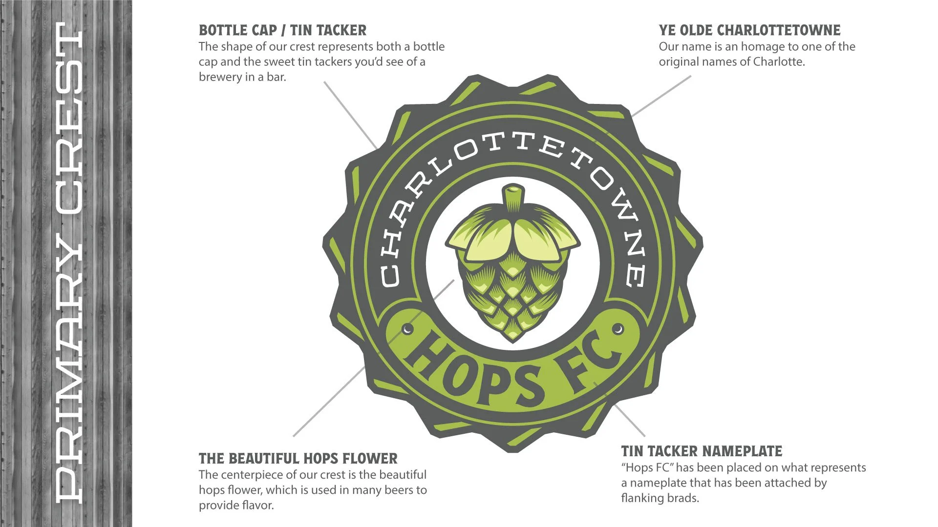
Round 2 is where it got fun. The more I looked at what I was working on, the more I thought it would look cool as a tin tacker (one of those tin beer signs you see in bars). With that in mind, I went to work on the center.
BUILD-A-CENTER
A: I started with a simple circle with a stroke. B: Created another circle, offset inside. C: Circle offset again, but further in. Leaving room for text. D: One more offset as a placeholder for a center object. E: Duplicated the two circles that will hold the text, then switched to a fill instead of stroke. I then used Shape Builder (SHIFT+M) to knock out the center. Then created two circles flanking at the bottom,. F: Used Shape Builder again to create a solid shape at the bottom with rounded edges. G: Offset that shape a bit. H: Used Shape Builder to knock that bottom shape out. That let the shape that will hold part of the text to keep its stroke. I: I took a couple of circles with a “shine”, then flanked either side of the bottom shape. That was to make it look like it was tacked on with brads (see tin tackers). J: I brought in the cap shape. It’s looking sweet. K: Added the text. Boy, that’s sexy.
For the rest of the logo, I brainstormed what to put in the center. The obvious thought was a hop flower. I also thought about a pint, as well as some other beer imagery. Ultimately, I gave them two options: the hop flower, and the CH and crown (I know they weren’t feeling it initially, but I thought it looked awesome and included it anyway). There was one version I left on the cutting room floor that I wanted to share (the pint glass shown here). I thought it was cool looking, though I knew it wouldn’t make it in the running.
In the interest of time, I won’t go into the build of the hop flower. It ended up being more complicated than I initially wanted, with a lot of shape building and refining. I also had to create a couple of custom brushes to finish it. It was a fun build as well, though. Here’s a better look at it isolated:
The hop flower
THE REVIEW
We were getting closer. They loved the hop flower and wanted to continue forward with it in future iterations. They felt FC should be in there somewhere so as not to confuse viewers into thinking they’re a brewery or tap room. Fair. They also liked that I used the hop flower in the O of HOPS for the secondary look, but they felt it was missing something. Off to Round 3!
ROUND 3
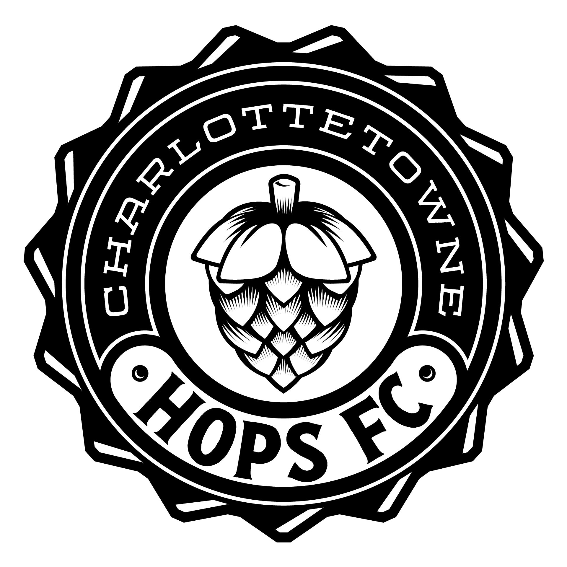
This would become the official one-color logo. The addition of “FC” to the bottom satisfied that yearning for a football reference. I was stoked on it, and they were, too.
ROUND 4 / COLOR
When discussing color, the owners were leaning toward a green-forward scheme. This is a direct reference to the color of hops. So, I provided three versions: two green-based and one wildcard. I like to include an out-of-the-box scheme as well in case it sparks something. This time, it did not. Sad face.
The first version, of course, is the one-color logo. With the second version, I pulled three shades of green from photos of hops, adding white and grey. With this being a retro-feeling name, I wanted the colors to reflect a vintage look. The third version is a more classic green, with white and yellow complementing it.
For the secondary mark, I removed HOPS all together, but I carried over the hop flower and replace the O. I then placed the full name underneath, flanked by bottle caps (another brilliant suggestion from Eleni).
LAST REVISION / THE FINAL PICK
The only change I made to the color scheme they picked was to reduce the amount of colors used. I felt three greens was a little much, so I nixed one. Other than that, it was good to go. They also liked the word mark as-is. The only thing left to do was to create the launch graphics.


They also requested a launch video, also created by me:
And that’s it for this edition of Up in Them Guts! I hope you enjoyed this deep dive into Charlottetowne Hops FC’s branding.
Thanks for reading!
Brian


