UP IN THEM GUTS: MR. THE PLAGUE
When I retweeted the Monster Eye shirt campaign on Twitter from my personal account, an old friend from my FC Dallas days responded:
My plague doctor sketch from Oct. 31, 2017.
In 2017, I participated in Jake Parker’s Inktober challenge. This is a yearly 31-day drawing challenge during the month of October meant to push artists and their creativity. Each day is a different prompt, and it is up to the artist to interpret its meaning. I have tried many times to participate, but I usually burn out after a few days.
2017 was my year, though.
I completed all thirty-one days, and though it was tough, it bore some pretty fun pieces. Day 31’s prompt was “mask.” I thought a plague mask would be a fun design to take on, so a-sketchin’ I went. The end result was posted to Instagram and Twitter, and that was that.
Fast forward to Wednesday. After reading Jason’s tweet, I thought it would be a fun design to revisit. With that, get your snorkels out and let’s take a deep dive into my process.
SKETCH TO VECTOR
The initial vector product. I added the while offset path for visibility here.
There a a few ways to vectorize images in Illustrator, each of which have different results. If I wanted a quick super sketchy result, I could just use Image Trace. But, even with Advanced features, it can be very unpredictable. I could also use the Pen tool and create anchor points along every path from the drawing. These days, I prefer a different route - one I learned from the great Aaron Draplin.
I started by snapping a photo of the sketch with my phone, then Air Dropping it to my machine. I placed the image in Illustrator (File > Place…, or SHIFT+CMD+P), put it on its own layer, dropped the opacity to 50% and locked the layer. I then started building the image using shapes. For the most part, I just used ellipses and rectangles initially. This gave me a base to work from once I was ready to move toward the more complex shapes.
The initial result yielded what I felt was a nice, clean design. I wanted an Old-English feel for the text, so I hopped over to Adobe Fonts and settled on Amador. If you don’t have an Adobe Cloud subscription, I highly recommend it. You will not only have access to every Adobe software product, but their font library is pretty nice.
DISTRESSING IN PHOTOSHOP
Since the subject of this design is The Plague, I knew I didn’t want it to remain clean. One great way to grunge up designs is to pop it into Photoshop.
I began by copying the entire vector image in Illustrator. With the image I want to work with copied to the clipboard, creating a new Photoshop file defaulted its size to the size of my vector design. Before clicking Create, I updated the resolution to something really high. I usually just do 6666. This step is to ensure you don’t lose detail when you start manipulating it with effects.
Once the file was created, I pasted the vector as a Smart Object (CMD+V > Smart Object). This places the design on its own layer, so I created a white solid background on a layer behind it. Just in case I need to tweak the image or try something else, I always make a copy of the smart object layer before proceeding, then turn visibility off.
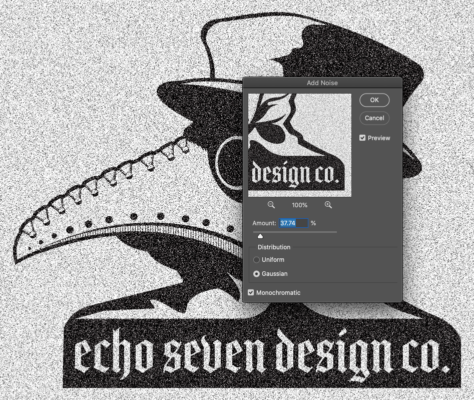
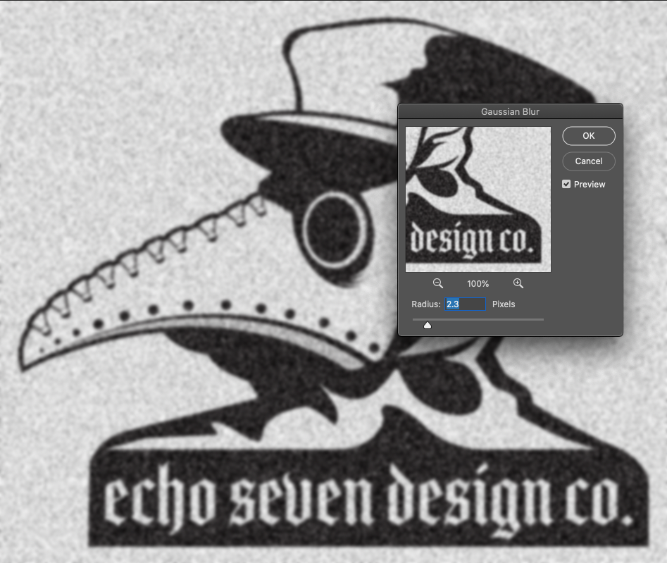
To manipulate the image as a whole, I merged the visible vector layer and the white layer. I added Noise to it (Filter > Noise > Add Noise), then a Gaussian Blur (Filter > Blur > Gaussian Blur). When adding noise and blur, the amount you use will depend on the desired effect you want. For this particular design, I didn’t want to do too much up front. You can always go back in and repeat the process if you didn’t get enough with the first round.
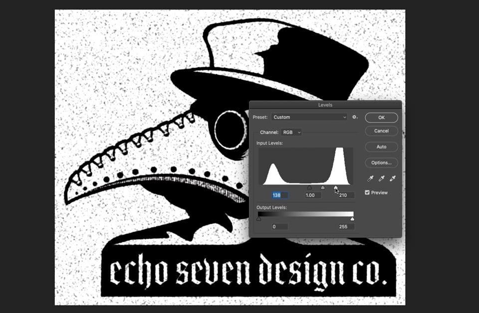
Once the noise and blur were complete, I adjusted the levels. This step will yield the desired grunginess. As you’ll notice in the video, the edges will start to become muddy. It’s a sometimes tedious process, depending on your taste. If, when you’re adjusting your levels, you notice too much loss of detail, you can just undo the two previous steps and adjust accordingly. Less is more initially. You can always go back and add more.
AND NOW, BACK TO ILLUSTRATOR
Next up is getting the grungy image back to Illustrator. True Grit Texture Supply has a really great action called Transparency. It removes the white background and keep only the black from the design. After the Action did its trick, I CMD+clicked on the design layer to select all of the black and clicked the Paths tab. I created a new work path, then went to File > Export > Paths to Illustrator. This saved the shapes as an AI file.
When I opened the file in Illustrator, the design was too small. However, since everything is vector, I was able to just Select All and scale up to my desired view. I did have to go through and give the shapes their color again, as the paths were the only things saved. Before moving on to the final distressing, I selected the bottom-most black layer, which was the shape of the entire piece. I then created an offset path and colored it white so that I would have that clean edge fully around it.
FINAL DISTRESSING
To give the design even more of a vintage, worn look, I needed to do a bit more distressing. There are a few methods to accomplish this. There are tons of textures you can find online, or you can make your own in Photoshop, then move to Illustrator using a similar method as the one detailed above with the plague design.
For this piece, I used one of the EPS files I have at my disposal that has already been vectorized. I took the entire block of dust and scratches, then created a Compound Path with it (Object > Compound Path > Make). I did the same with the black shapes. Once the Compound Paths had been created, I copied the dust/scratches path (this step was in case I wanted to change something later), then selected it and the black shapes path (ensuring the dust/scratches was the top path). I used the Minus Front shape mode to cut the dust and scratches out of the black shapes. This gave all the black shapes the look of pieces and parts being worn off. I got the image the way I wanted it the first time, so I didn’t need to paste the scratches again.
THE BACKGROUND
To post for social media, I wanted to do a background similar to the one I created for the Stay Home graphic from last week. This time around, I decided to use the biohazard symbol and a gas mask as the pattern. I quick-vectorized a biohazard symbol found on Google Image Search, then built the gas mask using shapes. Once I had both pieces ready, I created a pattern by going to Object > Pattern > Make. In preview mode, you can adjust these however you need to get the pattern looking the way you want.
When I created my rectangle and applied the pattern, I realized I wanted the pattern to be smaller. With the rectangle selected, I went to Object > Transform > Scale, then deselected “Transform Objects.” This allowed me to change the size of the pattern without altering the rectangle itself.
I rounded out the design by throwing a Drop Shadow on the Plague doc, and voila!


