UP IN THEM GUTS: WEST TEXAS FC
“Up in Them Guts” is an ongoing series where I break down the creation of a piece from start to finish. If you enjoy these, be sure to let me know in the comments!
- BP
I had the pleasure of working on another NPSL soccer team’s (re)branding, this time for West Texas FC. WTXFC was once the Midland-Odessa Sockers, a team in the Lone Star Conference of the National Premier Soccer League (NPSL). The Sockers took last season off, and after a change in ownership, they’re coming back to the conference as West Texas FC.
THE ASK
When I initially met with the clients, they expressed their desire to represent the whole of West Texas, not just Midland-Odessa. They are passionate about the game of soccer and Midland-Odessa, but they wanted a disconnect from the oil-themed feel several of the other local teams have.
THE RESEARCH / RECOMMENDATION
I recommended concentrating on landscapes instead of animal or human mascots for their rebrand. When I think of the West Texas region, I think of the sprawling landscape of sweeping flatland plains and mountainous mesas, the unrivaled beauty of a West Texas sunset, followed by the infinite night sky, the rich Hispanic and Native American culture, the beautiful stretches of farms and ranches, and of course, cowboys and gals.
INITIAL SKETCHES
For the first round, I sketched out some options with various landscapes, flora and other iconography that wasn’t oil related. In options 3 and 9, I went with the shape of the windmill, playing with placement. Option 6 was a wildcard (something I like to do during the creative process where I’ll present an option or two that was outside of the original ask to see if it sparks interest.
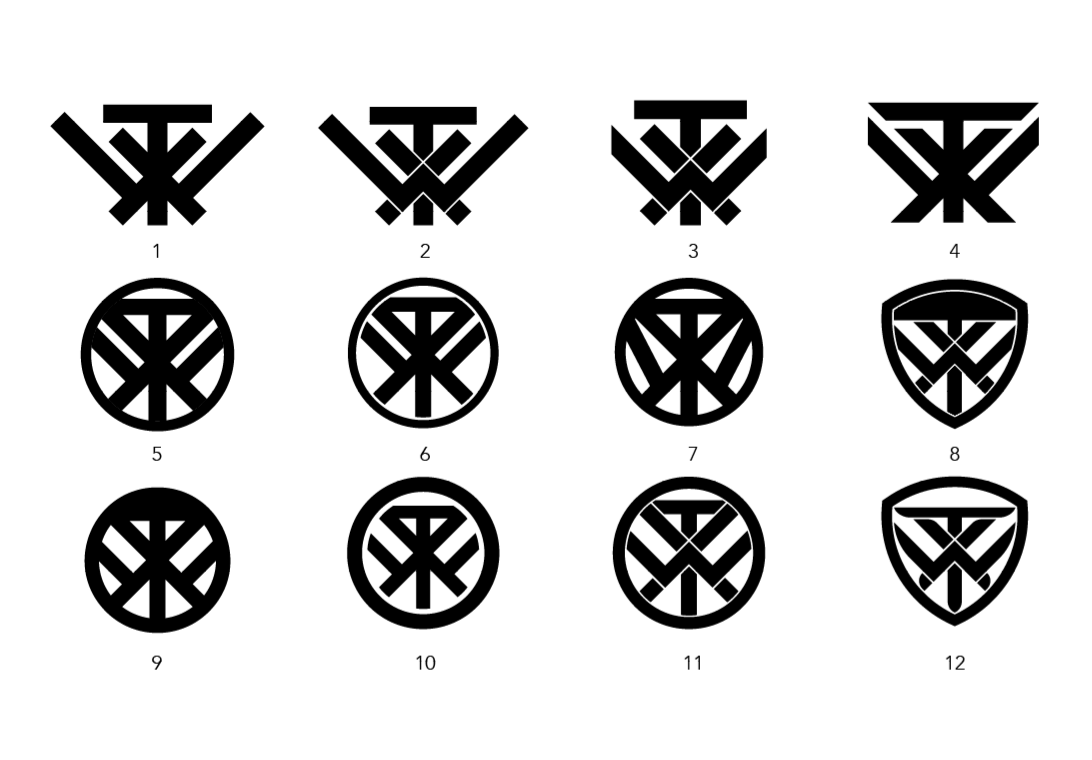
I also came up with the WTX icon (and its variations) shown in some of these options, inspired by Native American petroglyphs and rancher brands. I felt it would make a really strong secondary logo, much like the simple letters of many MLB teams.
ROUND 1 FEEDBACK + ROUND 2
All were in agreement that a landscape focus was the way to go. Figs. 1 and 5 were most favorable, so I leaned toward them as inspiration going forward. The WTX icon was also favored as a secondary logo.
The breakdown of Round 2 is below:
Fig. 1 - I took a mesa and river in a geometric direction. I tried to marry classic landscape with a modern look. You can do some really cool things with color in geometric patterns. Fig. 2 - I used the same mesa, but gave it more of an illustrative look. The lower third consists of a text treatment (actual treatment forthcoming), and the mighty yucca filling in the bottom semicircle. Fig. 3 - I like to try a curveball, just in case something sticks. I included the Texas flag, switching the star for a stylized yucca. Fig. 4 - Another landscape look, this time from further out. I also included a thunderstorm in the background, as well as a yucca to fill the bottom. Fig. 5 - A different landscape and river, including a soccer ball sun.
Fig. A - The original secondary logo, included for comparison. Fig. B - I brought the wings of the W in a bit and reduced the width of the T’s bar. Fig. C - I brought the T in slightly, but extended the arms of the W to give it more prominence.
ROUND 2 FEEDBACK + ROUND 3


It was unanimous that Figs. 2 and 4 were the most appealing at first glance. The clients were initially drawn to Fig. 4 the most, especially the addition of the thunderstorm. Upon further discussion, the group is leaning more toward Fig. 2. The shape of the crest is appealing and different, and the elements within don’t look overcrowded. The secondary logos included were discussed as well. It was unanimous that Fig. C is the one, though I did mention I’ll try a version that breaks the X out of the W.
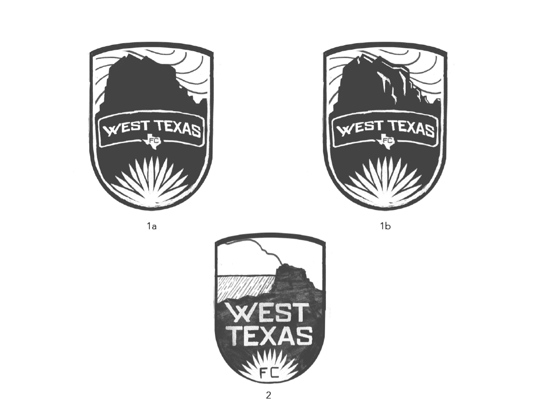
For Round 3, I took the feedback I was given and zeroed in on detail. I experimented with negative space, as seen in 1a and 1b. I liked the idea of the yucca plant being part of the negative space frame. I also liked having some representation of the sky. I also started to hone in on a wordmark.
For the secondary logo, I moved into digital since it was easier to manipulate the shapes than by hand. I may have gone a little overboard (go figure). I tried 12 different variations (and even accidentally came really close to emulating the SHIELD logo).
ROUND 3 FEEDBACK + ROUND 4


Fig. 1b was the unanimous pic overall (with tweaks). Elements of Fig. 2 were favorable (including the text treatment and additional element of the storm), though I was asked to remove the shape of Texas from the treatment. After all the different versions I created of the secondary logo, we circled back to the original version. I stated that I would use it to mock up some merchandise so they could get an idea what it would look like during end use.
PRIMARY: Making the bridge to digital, I created a black one-color version of what we discussed. I stacked West Texas FC instead of the full horizontal version I had been sketching. I feel this fills the area and will be readable from a distance better.
SECONDARY: At that point, we were really close to locking up the secondary logo. As stated, I threw it on some merchandise to get a sense of its iconic nature. Since we had not honed in on a color palette, I asked ownership to disregard the colors used in the mockups.
WORD MARK: I’m greatly inspired by old farm patches on trucker caps and work shirts, and that is evident in the word mark. I brought in the shape of the W from the secondary logo to connect them.
ROUND 4 FEEDBACK + ROUND 5


Overall, ownership was really pleased with the direction. However, since they are based in the flat lands of Midland-Odessa, they felt the size of the mesa in the design was too prominent. They do want to represent all of West Texas, but they want to ensure that people aren’t confused. The secondary logo was locked up at this point. I’m really stoked at the end result of it. It will look sharp on merchandise and flags. The word mark was well received, but they weren’t feeling the W. The more I sat with it, I agreed.
Round 5: Overall, I redid the word mark. When I enlarged the original version’s stylized W, it looked off to me. So I revisited it completely. I also customized every letter to make it more unique. MAGENTA MARKS: I was still working on the spacing at that point and notated them for my client. Fig. 1: Using notes from ownership, I created a version where the mesa is much smaller and centered. 1a has the shape of the wind, and 1b is without. Fig. 2: I shifted the mesa to the right, with the sun to the left. In version 2a, I still need to shift the sun over for better spacing. I also experimented with the frames for the 1-color versions. Fig. 3: I created a version using thoughts given during a call about trying a version removing the mesa all together. I also experimented with negative space.
ROUND 5 FEEDBACK + ROUND 6
At this point, the word mark was locked in. So, I turned all focus to the primary logo. The clients liked the negative space I had created stemming from the yucca. They wanted to see some variations, including a combination of 1a and 2a (The arch, but with the mesa to the right).
Figs. 1-3 were very similar, just with small tweaks here and there. We were all in agreement that the W from Fig. 2 didn’t work, so that idea was officially scrapped. Fig. 4 was a framed take of one of the previous iterations. Fig. 5 was more experimentation with negative space.


ROUND 6 FEEDBACK, A.K.A. WE HAVE A CREST! + COLOR OPTIONS
We have a crest! The clients found their 1-color version in the attached. They loved the feel of the mesa with the sky and sun, as well as the placement of the yucca, word mark and proximity of negative space within.
When it comes to color, I like to do some requested colors, but also some wildcards in case something fun and unique comes out of it. When I think of West Texas, I can’t help but think of the brilliant sunsets. Every color imaginable fills the sky once the sun starts its descent. Color Combo 1 was inspired by the deepest blue/purple, orange and yellow of those sunsets. Color Combo 2 was more purple, with the green of flora. Color Combo 3 was a wildcard, and Color Combo 4 was inspired by the blues and greys of Texas storms.
WE’RE THERE! + LAUNCH VIDEO
After a working Zoom session with the clients, we had a color palette and final crest! I was able to put together some launch graphics to break everything down.


I was also asked to put together a quick video to celebrate the launch of the new brand. You can view that below:
Overall, this one was a blast to work on. The new ownership of West Texas FC is awesome, and I hope they find success in NPSL.
Until Next Time, True Believers!
Brian


